Sorry for the lapse in posts for the last week - I was away from home part of the time and recovering from being away the rest of the time. I've got two more sets that I got a few weeks back to write about so let's knock one of those off now...
Topps' second NPB set was released in early September. Like last year's set, this year's edition has a 216 card base set split evenly into 18 cards per team. Again like last year, the design of the front of the card is similar to Topps' "flagship" MLB set - the big difference is that Topps moved their logo from the top of the photo on the MLB cards to the baseball on the bottom left of the card on the NPB cards (where the team logo appears on the MLB cards) and moved the team logo on the NPB cards to the bottom of the photo.
The set itself is...OK. I don't dislike it as much as I disliked last year's set (putting it on my top ten list of worst NPB sets) but I can't say I'm overly fond of it either. I will say that I think these cards look better than last years - especially since the player names are much easier to read. I had initially thought the photo selection was pretty good but after having the set in hand I'm not quite as sure. While there are some good photos in the set and the variety of poses is probably better than either this year's Calbee or Epoch "flagship" sets (which isn't saying much), there still seem to be an awful lot of "batters batting, pitchers pitching and catchers catching" cards. Topps does do a lot of horizontally oriented cards which I really missed from Calbee's offerings this year - I feel like those can really break up the monotony of repeated poses.
The player selection is a little odd. Topps cut WAY back on the number of "rookies" in the set (in this case by "rookie" I mean 2021 draft picks) - there's only 34 instead of the 60 there were last year (of course last year had a pretty awesome rookie class). There are no "new for 2022" foreign players in the set - in fact there's only 11 foreign players in all. With the size of the set being smaller than BBM's 1st & 2nd Version sets it's no surprise that there's some significant players missing from it - off hand the biggest names are probably Ayumu Ishikawa, Go Matsumoto and Shota Imanaga. Oddly enough though there's several players in Topps' set who aren't in BBM's "flagship" sets - the biggest names being Shintaro Fujinami, Kosuke Tanaka and Seiichi Uchikawa.
One major addition to this year's set were cards for the managers of all twelve teams. This is kind of odd considering how few cards are in the set to begin with and the fact that Topps hasn't included manager cards in their MLB "flagship" since 2010-ish. I'd be willing to bet that they did it just to include this photo in the set:
 |
| #67 |
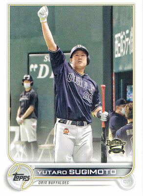
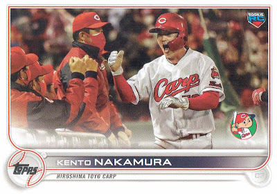
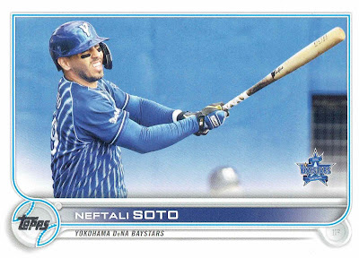
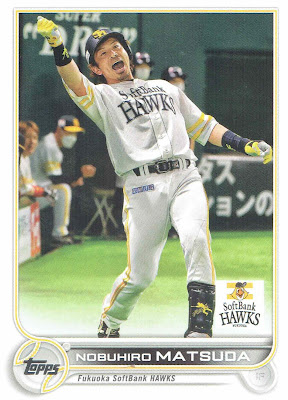
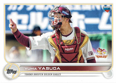
Here's some example cards - you can tell I liked the cards with the horizontal format:
 |
| #147 |
 |
| #77 |
 |
| #210 |
 |
| #11 |
 |
| #2 |
 |
| #66 |
 |
| #82 |
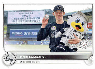
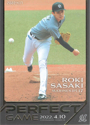
I'm amused that while BBM put a similar image to this on their "ultra secret version" photo variation for Roki Sasaki in this year's 2nd Version set but Topps is just using it as his regular card (not that I want Topps to start doing photo variations in the NPB set!):
 |
| #80 |
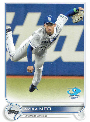
There's some baffling decisions Topps made with this set. Consider this card of Akira Neo:
 |
| #183 |
That's a great photo of Neo. There's just one issue - Neo isn't an outfielder anymore. He switched to being a pitcher in June, almost three months before this set was released. Topps could have been the first company to issue a "regular" card of Neo as a pitcher but they didn't - BBM's Fusion set will probably have that honor (although there's been at least one Epoch One card as well as a Calbee checklist card).
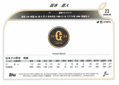
The card backs are the most inexplicable thing about this set though. Like last year, Topps appears to have put very little effort into these:
 |
| #23 (Hayato Sakamoto) |
Basic biographical information and one year's worth of stats along with a big team logo. And the managers don't even get the biographical information. I could understand this last year when Topps pushed a set out about two months after they signed their licensing deal but they had all year to come up with something in this case.
I think Zippy Zappy had the best comment on this set when he tweeted out a while back "This whole set reeks of 'we got the licensing deal done, let's just pump something out'. Like they already know the market already has established brands and options so they're just putting this out with only the bare minimum of effort and seeing what happens." Both he and Sean have done posts on the set and both are more critical of it than I am - although I don't disagree with anything either of them has said.
You can take a look at all the cards in the set over at Jambalaya.


